Pantone’s Cloud Dancer reflects a global mood shaped by chronic information overload, digital bombardment, and sensory fatigue — aligning with psychological research showing our minds seek simpler, calmer environments to recover.
Studies on attention restoration, environmental overstimulation, and colour-emotion links suggest that light, neutral tones support mental clarity and reduce cognitive strain, making Pantone’s choice symbolically resonant.
While white signals serenity and reset, it also carries cultural and political tensions. The colour’s neutrality is both desired and contested, revealing our complicated relationship with calm, retreat, and the meanings embedded in whiteness.
When Pantone announced Cloud Dancer — a soft, billowy white — as its Colour of the Year for 2026, it felt less like a colour forecast and more like a statement on our mental health. For the first time since the program began in 1999, the global colour authority chose a shade that is, essentially, the absence of colour: a lofty neutral meant to evoke calm, clarity and a “clean slate” in a world drowning in noise.
This Institute describes the colour as a “billowy white imbued with a feeling of serenity”, and that it “demonstrate our desire for contentment, and feelings of peace, unity and cohesiveness”.
“Similar to a blank canvas, Cloud Dancer signifies our desire for a fresh start,” explains Laurie Pressman, Vice President of the Pantone Colour Institute. “Peeling away layers of outmoded thinking, we open the door to new approaches. An airy white hue, PANTONE 11-4201 Cloud Dancer opens up space for creativity, allowing our imagination to drift so that new insights and bold ideas can emerge and take shape.”
Leatrice Eiseman, Executive Director of the Institute, frames it as a response to modern life: “At this time of transformation, when we are reimagining our future and our place in the world, PANTONE 11-4201 Cloud Dancer is a discrete white hue offering a promise of clarity. The cacophony that surrounds us has become overwhelming, making it harder to hear the voices of our inner selves. A conscious statement of simplification, Cloud Dancer enhances our focus, providing release from the distraction of external influences.”


Living in permanent overdrive
The Pantone Color Institute framed the choice explicitly as an answer to “cacophony” and distraction: a conscious simplification that helps us tune out external noise and tune back into our inner lives. That language lands because it feels true. The question is: can a white square on a color card really tell us something real about our mental life in 2025?
The color-psychology is still early as a rigorous science. But there are studies that connect white (or lightness / neutral shades) to what one might call “calm,” “clarity,” or mental/ emotional effects.
First of all, the broader diagnosis by the color institute is hard to dispute. Modern life is not just busy; it is structurally overwhelming.
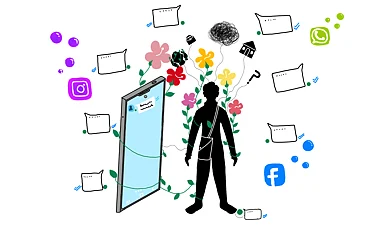
Research on technology and information overload shows that when digital demands go beyond our processing limits—too many emails, notifications, feeds—people experience mental fatigue, stress and reduced decision quality. One influential model of “technology overload” links information glut, constant communication and feature-heavy systems to burnout and lower productivity.
Environmental psychology has been mapping the other side of this problem for decades. Stephen Kaplan’s Attention Restoration Theory argues that directed attention—the effortful focus we use to cope with complex, noisy environments—gets exhausted over time. Natural or low-demand settings allow that system to rest and reset. Experiments by Marc Berman and colleagues make this more concrete: people who walked in nature or even just viewed images of nature showed significantly better performance on attention and working-memory tasks than those who walked through busy urban streets. Urban environments, dense with signage, traffic and stimuli, were measurably less restorative.
Meanwhile, recent work on sensory processing warns that many individuals—especially those with underlying vulnerabilities—report heightened sensitivity to sound, light and visual busyness, and that chronic sensory overload is associated with higher stress and poorer mental health.
You don’t need a lab to recognize this: timelines, breaking-news alerts, relentless political crises, permanent economic precarity. Into this landscape, Pantone offers a square of white and says: breathe.

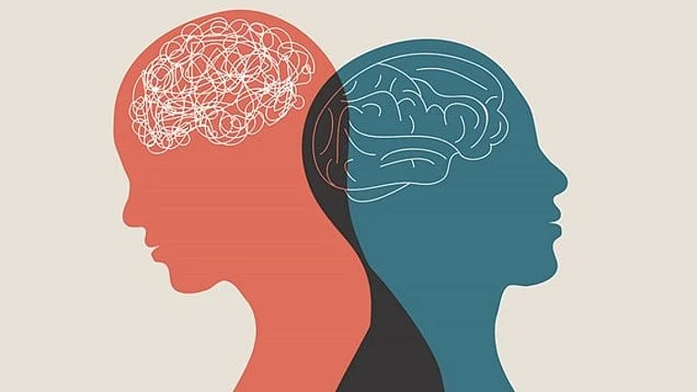
Does white itself do anything to our minds?
Color psychology is a messy field, and serious scholars are quick to stress its limitations. That said, a few strands of research help us understand why a white like Cloud Dancer might feel intuitively right as a symbol of mental reset.
A 2014 study by Na and Suk looked specifically at the emotional characteristics of white in product design. Participants rated various colors on emotional factors such as “flamboyant,” “elegant,” “clear,” and “soft.” White clustered as dominantly elegant and clear, and different whites could be tuned to feel softer or sharper, warmer or cooler.
In other words, even within the territory of “white,” people reported distinct emotional tones, with a recurring association of white with clarity, softness and a certain quiet sophistication. That maps quite neatly onto how Pantone describes Cloud Dancer: airy, balanced, a neutral that “steps back” rather than shouts.
Color-and-memory research also hints at why white might feel mentally “clean.” A review by Dzulkifli and Mustafar on color and memory performance highlights work showing that high-contrast, simple backgrounds—often black text on white—support better readability and recall than more saturated or tinted backdrops. Color can enhance memory in some contexts, but complexity and low contrast can also burden perception.
Taken together, these findings don’t prove that white cures anxiety. But they do suggest that light, low-chroma, high-contrast environments—of which white is the most obvious example—can support clarity, legibility and a feeling of mental lightness. In a culture where everything feels too much, clarity itself starts to look like comfort.

Pantone’s choice doesn’t arrive in a vacuum. It lands into a world already in love with the aesthetics of calm: “quiet luxury,” neutral interiors, wellness branding, the “clean girl” look on social media. Design culture has been drifting toward beige and off-white for years. Critics have pointed out that Cloud Dancer simply baptises the Instagram feed as destiny.
The politics of choosing white
Of course, in 2025, “whiteness” is never just about paint. As soon as the choice was announced, backlash followed. Critics called it tone-deaf and dystopian to crown “pure white” in a political climate scarred by white nationalism, racialized violence and a constant debate around who gets to stand in for “neutral.”
Pantone has insisted that Cloud Dancer is not about race but about calm—a “calming influence in a society rediscovering the value of quiet reflection.” Yet intention is not the only thing that matters; symbols accumulate meanings they can’t easily shake off. A white square in 2025 doesn’t appear on a blank canvas; it appears on top of centuries of history.
Colour psychology can’t resolve that tension. The same qualities that make white feel clear, elegant and mentally spacious in a lab—its lightness, its visual quiet—also underpin its cultural role as the default in galleries, interfaces and fashion: the background against which everything else appears. The politics of who gets to be “background,” who gets to be “neutral,” are not incidental.
What Cloud Dancer actually reveals about us
If we put all of this together—technology overload, sensory fatigue, the restorative pull of simplicity, the emotional connotations of white—we end up with something like this: We live in conditions of chronic overstimulation that psychology increasingly recognises as harmful to attention and mental health. Our nervous systems are drawn toward calmer, less demanding environments, whether that’s a park, a blank page or a clean, light-filled room. Light, neutral shades like Cloud Dancer symbolically condense that desire for simplicity, clarity and pause—a collective wish that the volume be turned down.
Pantone’s choice doesn’t tell us what to feel, but it does tell us something about what many of us are already feeling. The institute is exceptionally good at reading the cultural weather. This year, it has decided that the weather report is simple: too much noise, not enough quiet.
Whether Cloud Dancer becomes a colour we actually wear or decorate with is almost beside the point. As a symbol, it crystallises a tension of this moment: our longing to step back and breathe, set against structures that keep dragging us into the feed, the fight, the next emergency.
Our desire for a calmer world has manifested, for now, as a small square of white. It’s not a solution. But it might be a clue.