When we met Devyani Pare last month during her visit to India, she had just returned from a year of remarkable international achievements. Across more than 25,000 stores in the United States and Canada, her design systems shape how millions of consumers experience brands they know by name but rarely think about visually. Pare, now an established designer at Pearlfisher in New York, has led brand identity and packaging work for major players including Blue Buffalo, Gushers, and SkinnyPop. Her designs have featured in national campaigns amassing over 50 million views, generated multimillion‑dollar retail impact, and earned her two Honorable Mentions in Graphic Design at the 2023 International Design Awards, one for Music Video Environments and another for Mothers, a thoughtful conceptual rebrand of the iconic South Asian condiment brand Mother’s Recipe.
Her trajectory exemplifies the global reach of top-tier Indian designers, an approach that connects the tactile care of craft with the commercial precision of international branding. Pare discussed her path, her process, and what drives her continued exploration of design as both industry and art.
Q: You have built a significant body of work across global consumer brands. Looking back, which projects have defined your career the most, and why do you think they resonated internationally?
A: I’ve been fortunate to work on projects that balance creativity with performance. Through a limited edition Gushers Pack, where the theme was galaxy, I got the opportunity to tap into a sense of child-like wonder. I experimented with playful illustrations and paired it with expressive typography. Whereas on SkinnyPop, I worked on a cohesive system that merged structure with a bold personality, and translated it across different formats. Each project I work on continues to teach me how intentional design, thinking, and exploration can turn into results, form a genuine connection with the audience, and create meaningful impact.


Q: Your project, Mothers received an Honorable Mention at the International Design Awards. What was the creative challenge in reinterpreting such a culturally rooted Indian brand for broader audiences?
A: The challenge was respecting the familiarity of the brand while giving it a fresh voice that connects beyond nostalgia. I focused on highlighting the origins of each ingredient, while elevating the visual language. Using subtle cues in the process helped evoke authenticity while positioning it in a more global context. Color indicates spice levels, where red signifies the more fiery flavors, and green leans towards mild. Typography and clear hierarchy, combined with photography serve as an ode to the origins. At the same time, I wanted to challenge the conventions seen in traditional pickle packaging, and explore how far we could strip back while still honoring their roots.
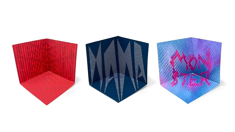
Q: Your second IDA honor, Music Video Environments, seems very different, personal and almost sculptural. How did that evolve alongside your commercial practice?
A: This project started as a daily exploration of paper, understanding how form and perspective can tell a story. I’ve always been drawn to the structure of paper, how it has potential beyond its 2 dimensional surface. I explored it in a new light by creating tiny 3D pieces for design to thrive with different perspectives. It ties well into the kind of work I do commercially with packaging, where dimensionality plays a central role. While the artboards I design on are flat, the end result is not, and I need to ensure each surface connects back to the beginning. Projects like this help me sharpen my skills in structure and detail, strengthening how I approach my commercial work.
Q: How has your time at Pearlfisher influenced your methods, and what’s it like leading visual systems for brands that interact with millions every day?
A: Pearlfisher nurtures concepts and ideas, makes them grow from a seed. I’ve learned to gather more thinking and reasoning behind my design choices, and be more intentional. Working in an environment where I can collaborate with peers, seniors and clients across varying markets leaves me feeling very inspired. All of this informs my design approach, where the goal is to build identities that can last.
Q: What stood out to you most during this recent trip to India?
A: Visiting my old house, my grandparents, and the places I used to frequent, took me back in time. It reminded me that my early visual instincts were formed here, through storytelling, colors, and tradition, that I believe still influence my thinking. I’ve taken a bunch of photographs, not only to document my month in India, but to capture details I barely noticed as a child, like signs, wall paintings, posters, and books. They are the moments of everyday life that shaped me, and continue to inform the way I design.
Q: You work across continents but often reference Indian visual language with restraint rather than overt symbolism. How does that cultural balance play into your design philosophy?
A: I think good design speaks universally when it begins from something personal and sincere. For me, that balance draws inspiration from my Indian roots subtly through color, texture, and storytelling, and gives the work its meaning. It allows me to create designs that feel authentic, at the same time, resonate globally.
Q: What advice would you give to young designers in Asia who aspire to work at a global level?
A: I would say stay curious, and consistent. Create with intention, and be clear about the reasoning behind your choices. Your personal experiences and perspectives hold value and can help your designs connect with people at a global level.
As we concluded the interview, Pare remarked that design, at its best, is a language of continuity, one that ties memory to modernity, markets to meaning. Judging by the brands and accolades already under her belt, hers is a voice that looks set to travel even farther.