T
he summer of '95 was an uneventful one. The P.V. Narasimha Rao government was sunk in ennui. The economic reforms that had been kickstarted in the early '90s had, after the initial enthusiasm, lost pace and buzz. Scams in public life were so regular that to read about yet another one being unearthed elicited just another big yawn. The print media looked tired and out of ideas after a glorious run in the '70s and '80s. In those somnolent times, news of a new newsmagazine's arrival would normally not merit more than a column centimetre in an obscure inside page of a newspaper. But there was a quiet buzz at the capital's Press Club of India—the only watering hole for news hacks then—about a 'fugitive editor' (as the now-defunct Sunday magazine would call him) launching, for the seventh or maybe the eighth time in his career, a new journal.Many such ventures in the past decade had faded away with quiet requiems—crushed under the weight of the mighty India Today. The other newsmagazines—Sunday, Frontline and The Week—were feeble challengers to IT's muscle. But Vinod Mehta's new weekly was expected to be different, to bring in some much-needed freshness into the world of magazine journalism, and a sustainable presence at the newsstand.
Outlook started from a single room in a crumbling carcass of an ITDC hotel. I had very little experience of designing a news magazine. The magazine format was new to our editor as well. Some of our team did have valuable magazine experience, and they would hold forth expansively on typography, colour, layout; how Time does it, how Newsweek would do it. It left us all even more confused.
Design is the frame that holds a magazine together, it's the subtle yet vital component that distinguishes one magazine from the other. Without design, a magazine is merely a melange of disparate elements; with it, it is a disciplined entity. The enormity of the task at hand was weighing me down, until the Editor, whose taciturn nature can be unnerving at times, finally broke his silence with an inspirational speech that galvanised all of us. He said, "Let Time, Newsweek, India Today do whatever they like. Here we have a splendid opportunity of creating something of our own. Let's do it without the burden of thinking what others have done."
For starters, we had a few positives that weighed on our side. We had identified India Today as our principal competitor. The benefits of this were two-fold. Firstly, our opponent's enormous circulation figures shook us out of our initial inertia, and spurred us to try and match them. Secondly, IT was a fortnightly, and by the time it appeared on the stands much of its currency was lost. The long gap between two issues robbed it of the surprise element so vital to a news magazine, and gave its contents a boring predictability. Moreover, India Today in '95 looked visually tired, with its cluttered look, inelegant typography, toss-away visuals and lack of attention to detail. It was designed more or less by default, not by professional designers but by layout artists, who rigidly followed an already tight template. A BBC correspondent at the time, leafing through a copy of the magazine, remarked to me that IT's Macintosh seemed to have gone amok!
When we started out, we had the privilege of not being weighed down by the greatness of our back-issues. This allowed us a fair degree of leeway and an openness in dealing with the visual aspect of the magazine. Outlook's visual personality, we decided, will be elegant and minimalist, with authoritative typography, sophisticated visuals and judicious use of colour; and lively pacing that would make the editorial material flow seamlessly from one story to the next. We would try to keep a surprise element for the reader, but not in a way that would make him wonder about the mental health of our Macintosh!
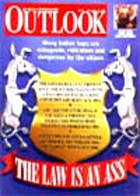
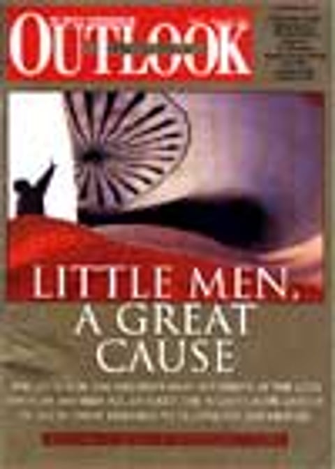
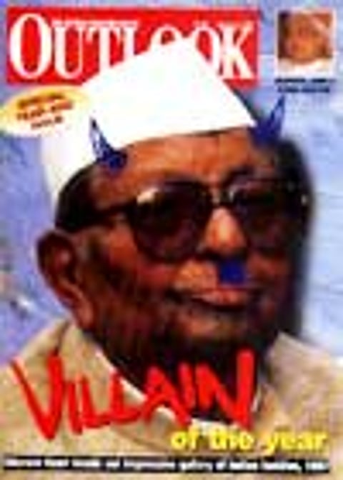
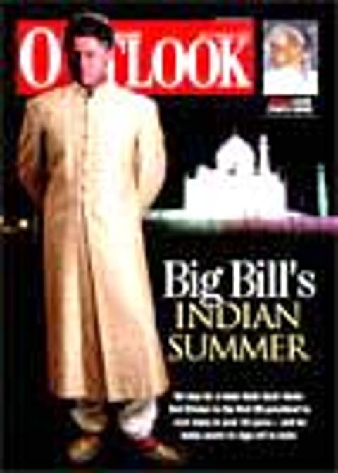
We were well aware that the cover of the magazine would be a critical factor in determining whether the reader would ultimately buy Outlook from the stands. We identified four key areas to address this issue: